When working with data in Google Sheets, percentiles and quartiles are both ways to understand how values are distributed—but they serve slightly different purposes. A percentile tells you the value below which a certain percentage of data falls. A quartile is a specific type of percentile that divides data into four equal parts. Understanding how they relate, and when to use each can make your analysis far more meaningful, especially when summarizing large datasets or spotting outliers.
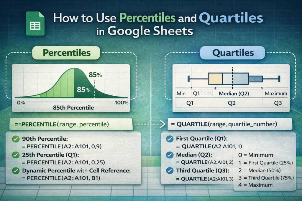
In short: quartiles are predefined percentiles. The first quartile (Q1) is the 25th percentile, the second quartile (Q2) is the 50th percentile (the median), and the third quartile (Q3) is the 75th percentile. Google Sheets supports both concepts, but through slightly different functions and use cases.
When Should You Use Percentiles Instead of Quartiles?
Percentiles are more flexible than quartiles. If you want to know the top 10% cutoff, the median of the top half of your data, or the value that separates the lowest 5% from the rest, percentiles are the right tool. They’re especially useful in performance analysis, grading systems, income distributions, and SLA tracking where custom thresholds matter.
Quartiles, on the other hand, are best when you want a standardized summary of spread. They’re commonly used in box plots, statistical summaries, and exploratory analysis. If your goal is to quickly understand how data is distributed across four equal groups, quartiles are faster and easier to communicate.
How Do Percentiles Work in Google Sheets?
Google Sheets calculates percentiles by interpolating values within a sorted dataset. This means the result may not always match an existing data point—it can fall between two values. This is important to understand because it explains why percentiles sometimes return decimals even when all source values are whole numbers.
Another key detail: Google Sheets follows a continuous percentile calculation method, similar to Excel’s PERCENTILE.INC. This makes results consistent across platforms but can differ from older statistical definitions you might see in textbooks.
Google Sheets Percentile Formula Examples
Use these formulas in their own cells, referencing a clean numeric range:
- 90th percentile:
=PERCENTILE(A2:A101, 0.9) - 25th percentile (equivalent to Q1):
=PERCENTILE(A2:A101, 0.25) - Dynamic percentile using a cell value (for dashboards):
=PERCENTILE(A2:A101, B1)
This last approach is especially powerful for interactive reports. By changing the value in B1 (for example, 0.8 or 0.95), you can instantly see different cutoffs without rewriting formulas—a feature rarely mentioned in basic guides.
How Are Quartiles Calculated in Google Sheets?
Quartiles are calculated using the QUARTILE function, which is essentially a shortcut for common percentiles. Instead of passing a decimal, you pass an integer from 0 to 4:
- 0 = minimum
- 1 = first quartile (25%)
- 2 = median (50%)
- 3 = third quartile (75%)
- 4 = maximum
Google Sheets Quartile Formula Examples
- First quartile (Q1):
=QUARTILE(A2:A101, 1) - Median (Q2):
=QUARTILE(A2:A101, 2) - Third quartile (Q3):
=QUARTILE(A2:A101, 3)
Behind the scenes, these results match what you’d get usingPERCENTILEwith 0.25, 0.5, and 0.75. The advantage ofQUARTILEis readability—someone reviewing your sheet can instantly understand what the formula represents.
Are Percentile and Quartile Results Always the Same?
They’re mathematically aligned, but practical differences can appear in how people interpret them. Percentiles encourage precision and customization, while quartiles emphasize structure and comparability. One subtle but useful insight: when building box plots or interquartile ranges (IQR), using QUARTILE keeps formulas consistent and easier to audit, even though PERCENTILE would technically work.
Another lesser-known detail is performance. On very large datasets with thousands of dynamic percentile calculations, using QUARTILE for standard cutoffs can be slightly more readable and maintainable, reducing formula complexity in shared files.
What Are Common Mistakes When Using Percentiles or Quartiles?
A frequent mistake is misunderstanding the percentile input. Google Sheets expects percentiles as decimals, not whole numbers. Using 90 instead of 0.9 will return an error. Another common issue is including blank cells or text values in your range, which can skew results or cause unexpected behavior.
Users also sometimes mix statistical intent with ranking logic. Percentiles measure distribution, not rank order. If you want to label rows by percentile rank (for example, “top 10%”), you’ll often need an additional formula using RANK or PERCENTRANK alongside PERCENTILE.
How Do Percentiles and Quartiles Compare Across Platforms?
Google Sheets and Excel Online behave very similarly for percentiles and quartiles, making shared files reliable across platforms. However, older Excel versions and some statistical tools may use slightly different interpolation rules. If you’re sharing results with stakeholders who rely on external software, it’s worth noting which method you’re using to avoid confusion when numbers don’t match exactly.
How Should You Choose Between Percentile and Quartile in Real Projects?
Choose percentiles when your analysis requires custom thresholds, interactive dashboards, or performance benchmarks beyond standard quarters. Choose quartiles when summarizing data, building box plots, or communicating distribution in reports where simplicity matters.
A practical hybrid approach is common in real-world Sheets projects: use quartiles for summary statistics at the top of a report and percentiles within the analysis or visualization layer. This keeps your sheet both readable and powerful. An approach we use consistently in Sheetrix templates designed for analytics, finance, and planning.
Understanding the difference between Google Sheets percentile vs quartile isn’t just about formulas. It’s about choosing the right lens for your data. Once you know when to use each, your spreadsheets become clearer, more accurate, and far more useful.